
Brightland: When Did Olive Oil Become a Design Object?
How Brightland turned one of the most ordinary ingredients in the kitchen into something people want to taste, display—and give as a gift.
WORDS BY BRANDDIP · CALIFORNIA
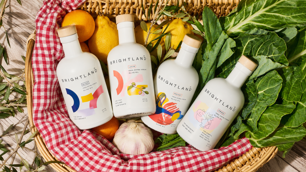
There was a time when buying olive oil was mostly practical.
You looked for extra virgin. Maybe you checked where it came from. Then the bottle disappeared into a cupboard somewhere between the vinegar and the salt.
Brightland had a different idea.
What if olive oil didn’t have to disappear?
What if something as ordinary as cooking oil could be chosen with the same attention we give to coffee, wine, skincare—or the objects we place around our homes?
Founded by Aishwarya Iyer in 2018, Brightland entered the kitchen with California-grown olive oil, unusually considered packaging and a vocabulary that felt closer to a lifestyle brand than a traditional pantry label.
Suddenly, the bottle belonged on the counter.
Brightland didn’t invent premium olive oil.
It changed what premium olive oil could look and feel like.
The Pantry Wasn’t Supposed to Be This Interesting
For decades, many everyday food categories were designed around information.
Origin. Weight. Ingredients. Certification. Price.
Useful things to know, certainly—but not necessarily things that make you feel anything.
Brightland approached the category differently.
Its opaque bottles are simple enough to feel almost cosmetic. Color, illustration and typography distinguish different oils and limited editions. Sets arrive looking less like groceries and more like something deliberately selected.
But the design isn’t entirely decoration.
Olive oil is sensitive to light, heat and air, so Brightland uses UV-protected bottles and emphasizes harvest dates, sourcing and freshness alongside the visual identity.
That combination matters.
The bottle gets your attention. The information gives you a reason to trust what’s inside it.
From Ingredient to Object
Brightland arrived at a moment when the kitchen was becoming increasingly visible.
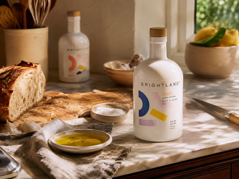
Open shelving replaced closed cupboards. Coffee equipment became part of the interior. Cookbooks moved from shelves onto tables. Even a bottle of hand soap could become an aesthetic decision.
The pantry was no longer entirely backstage.
Brightland understood that shift unusually well.
Its olive oil doesn’t need to be transferred into another container or hidden after use. The original packaging is already designed to participate in the room.
That changes the relationship between product and consumer in a subtle way.
You aren’t simply buying an ingredient.
You’re choosing an object that happens to contain one.
When the pantry becomes visible, even olive oil becomes part of your taste.
But Pretty Isn’t Enough
There is an obvious danger in making food look this good.
The branding can become more memorable than the thing being sold.
Brightland seems particularly aware of that problem.
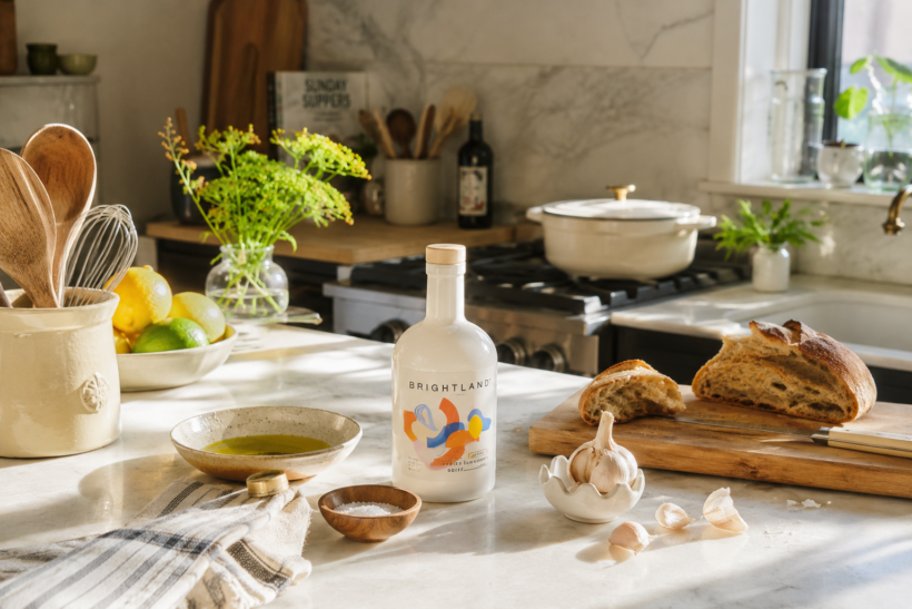
Behind the photography and packaging is an unusually persistent conversation about what is actually inside the bottle.
The brand works with family farmers and local makers, highlights California-grown ingredients across much of its collection, and talks openly about freshness, production and traceability.
Its extra virgin olive oils are cold-pressed, and the brand makes harvest information part of the buying experience rather than leaving it buried in fine print.
This is where Brightland becomes more interesting than another photogenic direct-to-consumer brand.
Design creates desire. Transparency tries to justify it.
And that combination has helped make something remarkably ordinary feel worthy of consideration again.
The New Luxury Is Paying Attention
Brightland has since expanded beyond olive oil into vinegars, honey, kitchen accessories and gift sets.
That expansion makes sense because the real product was never only olive oil.
It was a way of looking at everyday ingredients.
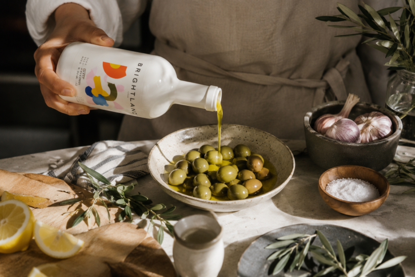
A bottle you normally replace without thinking becomes something you compare, learn about, leave on the counter and maybe even give to someone else.
There is something distinctly contemporary about that kind of luxury.
Not rarity for the sake of rarity.
Not a logo announcing how much something costs.
Just more attention paid to something that was previously easy to ignore.
Maybe the most interesting brands don’t always create new desires.
Sometimes they teach us to look again at things we already have.
Why Brightland Matters
Brightland is part of a broader change in how everyday products become brands.
Categories that once competed mainly on price, familiarity or function are increasingly competing on worldview.
Who made this?
Where did it come from?
Why does it look like this?
And does having it around say something about how I want to live?
Brightland found those questions inside a bottle of olive oil.
That’s what makes the brand worth watching.
Not because olive oil suddenly became fashionable.
But because Brightland showed how much branding territory was hiding inside something we barely noticed.
BRANDDIP TAKE
Brightland didn’t make the pantry more luxurious. It made the pantry worth paying attention to.
DISCOVER BRIGHTLAND
Explore the brand, its olive oils and the story behind them at the official Brightland website.
WORDS · BRANDDIP
CATEGORY · TASTE OF BRAND
CALIFORNIA, USA